

UX Pay
A bank on one page.

- Type
- Landing page
- Industry
- Finance
- Platforms
- Landing page and app
The problem
Yet another digital bank had to show why it's different.
UX Pay is a digital bank with an account, card and spending insights, in a market full of lookalikes.
The page had to explain the product fast and show the app, which is what customers actually use.

The one-page site up close.
The solution
What we did
We designed a one-page site that shows the app in use from the top and explains the account, card and insights in short sections.
The app follows the same purple identity, so people feel they downloaded what they saw on the page.
Decisions
The 3 key decisions
What we decided before designing, and why.
The app as the hero
Above the fold is the product in someone's hand, not a slogan.
Short sections
Each benefit in one block, with one sentence and one screen.
One identity across site and app
Purple and the same shapes in both, so nothing feels disconnected.
Project
The result
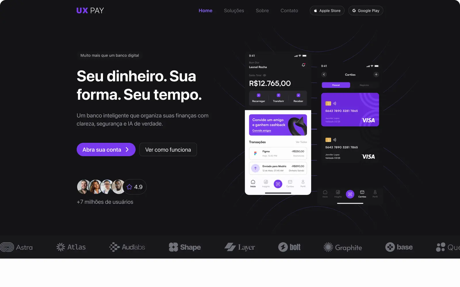
01 The full page.

Deliverables
What we deliver
- 01Landing page
- 02App
