

Smile Food
Hard not to order.
- Type
- App
- Industry
- Food
- Platforms
- App, landing page and brand
The problem
Frozen food looks like a last resort.
Smile Food wanted to sell restaurant-quality ready meals, frozen and delivered to your door, for people who don't have time to cook and don't want to eat badly.
Restaurant-quality frozen meals for people short on time who don't want to eat badly.
The problem was the category: frozen meals feel like a makeshift fix. Without a brand that showed real food, the premium price didn't hold up.
Frozen meals feel makeshift. Without a strong brand, the premium price didn't hold up.

The brand in people's hands: the four flavors held by the people eating them.
The solution
What we did
We built the entire brand around the dish: the smile in the logo's “m,” one color per flavor and the food always front and center, on packaging, in photos and in videos.
The brand was built around the dish: the smile in the “m,” one color per flavor and the food up front.
On that foundation, we designed the ordering and delivery app and the landing page that leads to it, in the same tone: quick to understand and makes you want to order.
Then came the ordering app and the landing page, quick to understand and made to drive orders.
Decisions
The 3 key decisions
What we decided before designing, and why.
One color per flavor
Ancho in red, rice and beans in purple, green bowl in green, salmon in blue. People recognize the dish before reading its name.
Each flavor has a color. People recognize the dish before reading its name.
The lid shows what's inside
The packaging is the storefront: a photo of the dish on the lid, prep time and badges as icons. It works in the grocery freezer and on the app screen.
The packaging is the storefront: dish on the lid, prep and badges. Works in store and in the app.
Order in three taps
From menu to courier on the way: choose, review the cart and track on the map, with no long signup before the first order.
From menu to courier on the map, with no long signup before the first order.
Project
The result
01 Salmon packaging, with the flavor's color in the background.
02 The flavors in motion: short videos for social and the landing page.
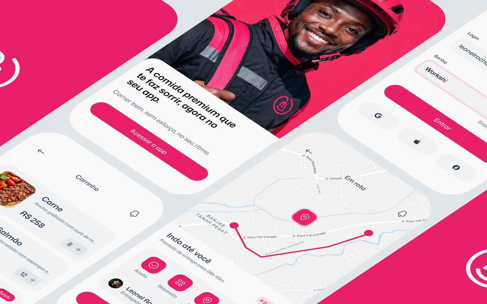
03 Ordering app: from menu to courier on the map.
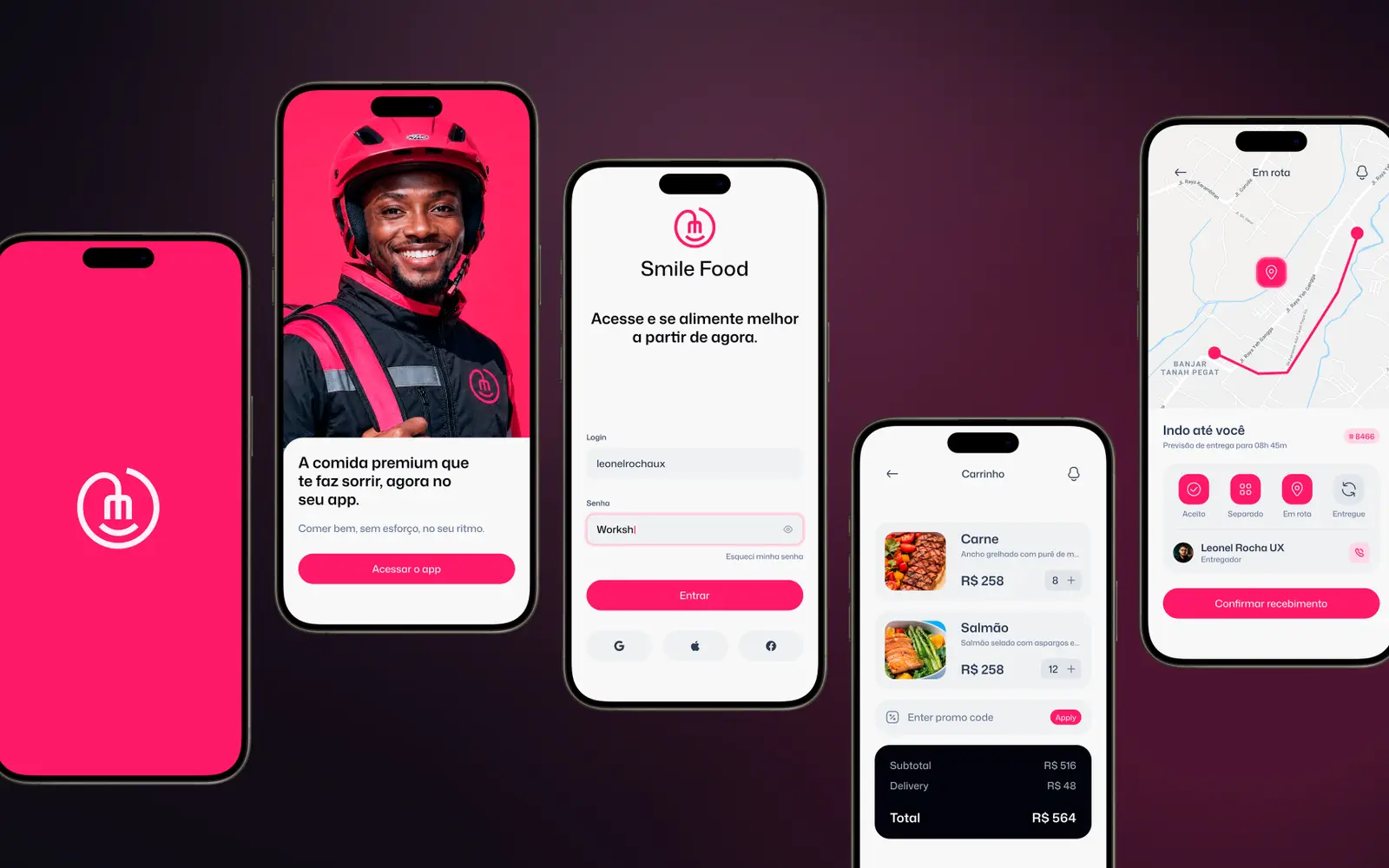
04 The app screens side by side.
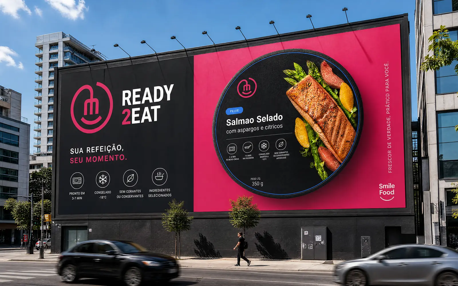
05 The brand on the street.
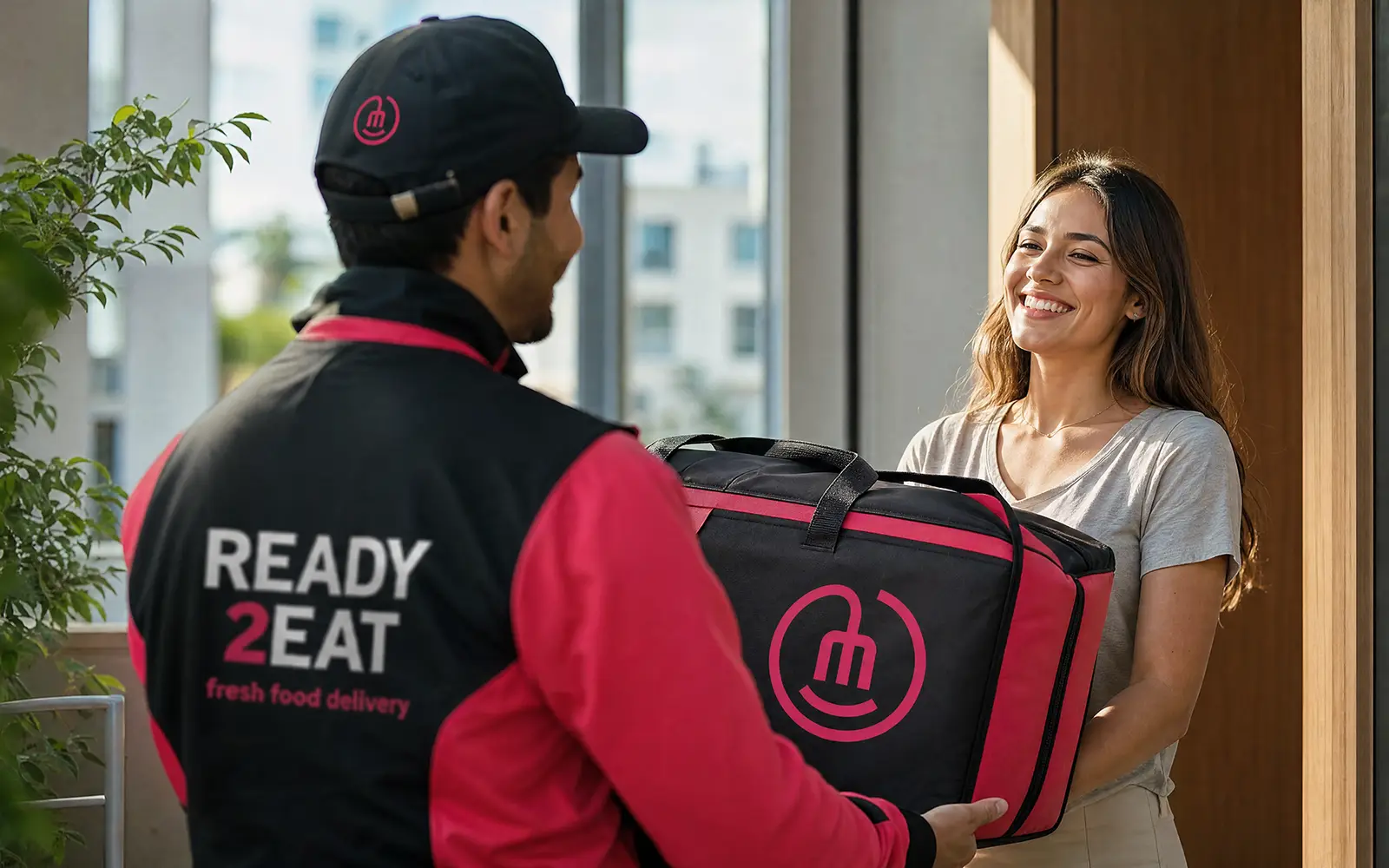
06 Delivery: the backpack and uniform follow the same identity.
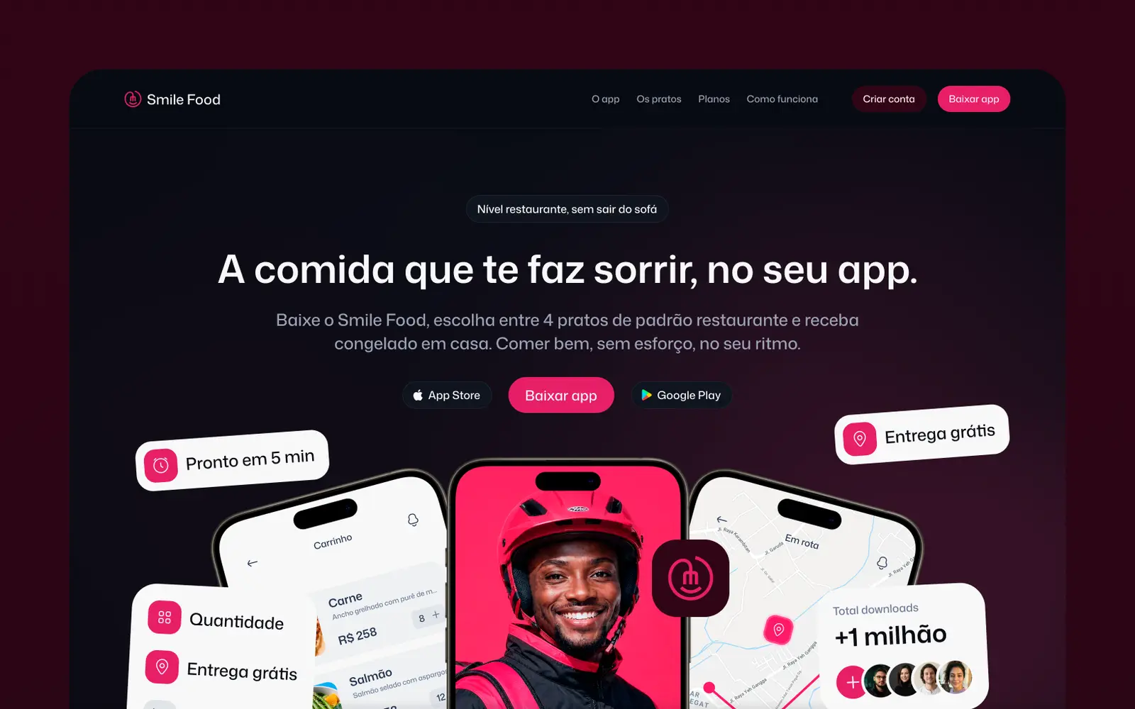
07 Landing page that leads to the app.


Deliverables
What we deliver
- 01Brand
- 02Packaging
- 03AI photos and videos
- 04iOS app
- 05Landing page
- 06Street materials
