

Cheff de Casa
A page that makes you hungry.

- Type
- Landing page
- Industry
- Food
- Platforms
- Landing page and identity
- Year
- 2026
The problem
The product was good, the page didn't sell.
Cheff de Casa sells a method for prepping the week's meals at home, spending far less than ordering takeout.
The offer had to win over people who think they can't cook. Explaining in text wasn't enough: people needed to picture themselves doing it.

Identity in blocks: food, brand and the page.
The solution
What we did
We designed the sales page around a line that speaks to the pain: “You don't need to be a chef, you just need to stop spending R$40 a meal.”
The page centers on the pain: “You don't need to be a chef, just stop spending R$40 a meal.”
The page mixes food photos, testimonials and the savings math in short blocks, and works from mobile to desktop.
Decisions
The 3 key decisions
What we decided before designing, and why.
The pain in the headline, the method after
First the takeout spending, then the solution. People recognize themselves before hearing the offer.
A photo grid instead of paragraphs
Bento blocks with food, people and numbers: you get the offer with a quick scroll.
Warm orange and a serif
Gelica with orange feels like a home kitchen, far from the online course look.
Project
The result
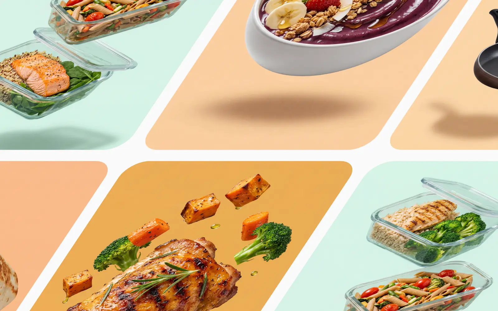
01 The week's dishes, ready to store.
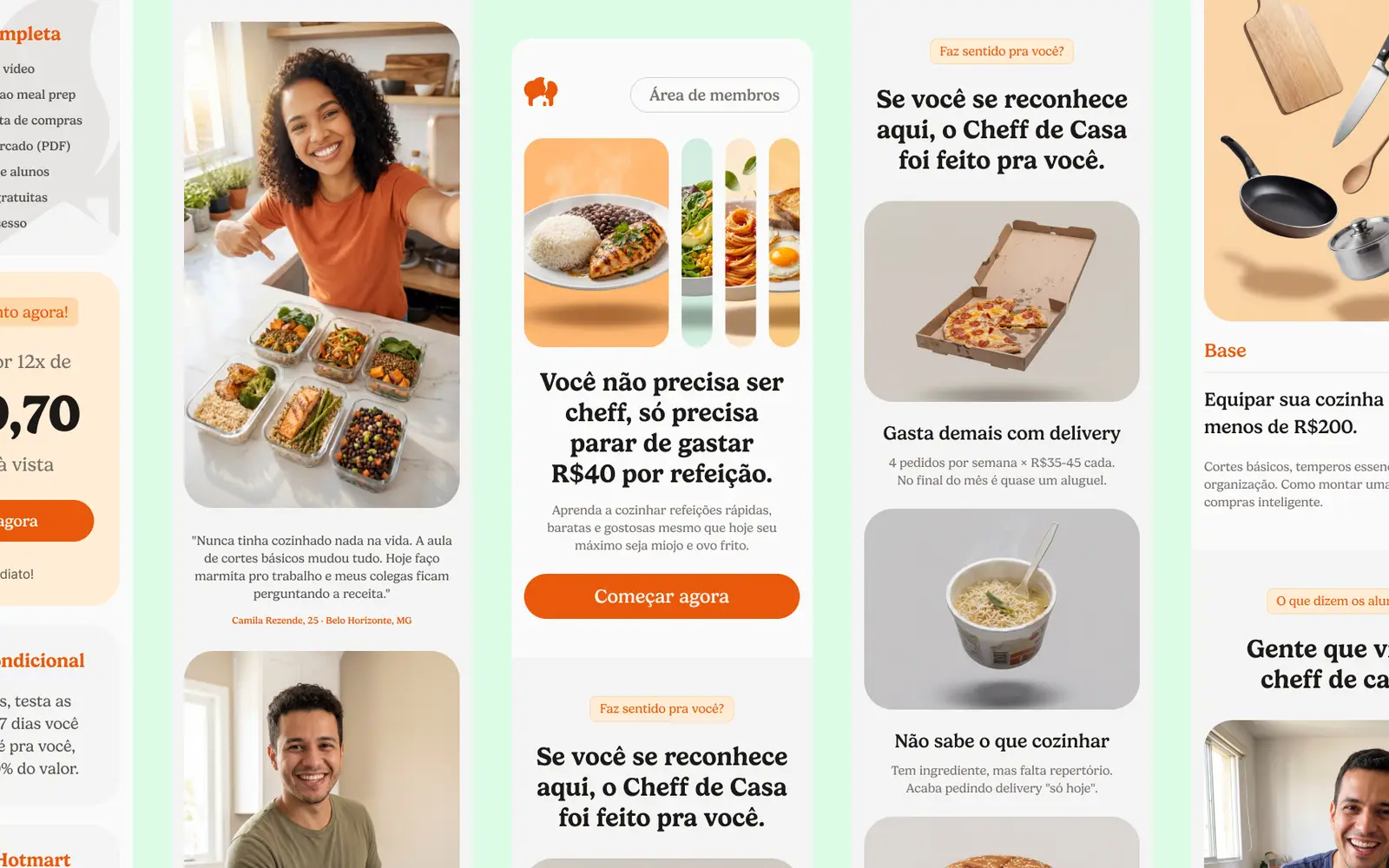
02 The sales page sections.
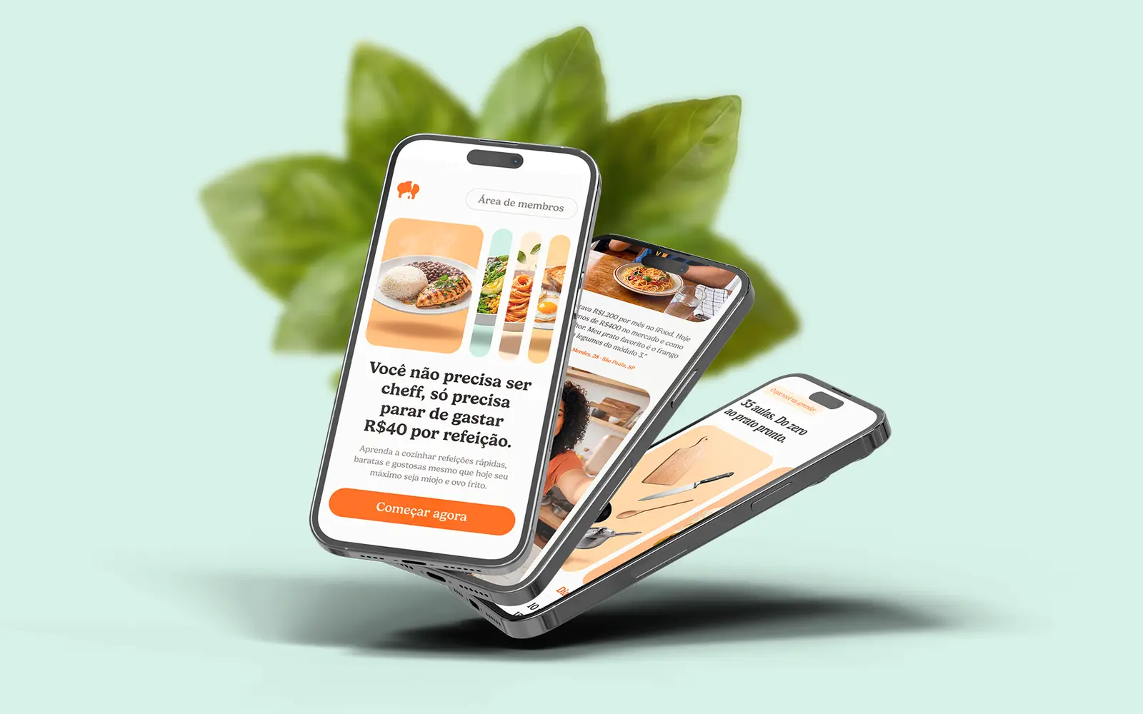
03 The page on mobile.
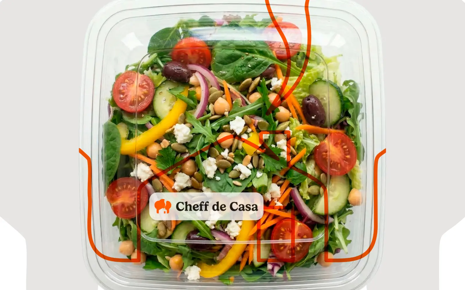
04 Product photo for the page.


Deliverables
What we deliver
- 01Sales page
- 02Visual identity
- 03Mobile version
