

Fluxa
The dashboard inside the page.

- Type
- Landing page
- Industry
- Fintech
- Platforms
- Landing page and dashboard
- Year
- 2026
The problem
A digital bank needed to show the app, not just talk about it.
Fluxa brings account, card, Pix and goals together in one app.
Digital banking is a market of look-alike pages. The difference had to show in the product, right on the first scroll.
The live site, working. Scroll, click and try it.
The solution
What we did
We designed the landing page and the dashboard in Figma, with AI-generated images, and shipped them in code in 1 day.
The whole dashboard lives in the page: tabs highlight each area, the chart shows the active month and goals fill up as you scroll.
Decisions
The 3 key decisions
What we decided before designing, and why.
Product in the window
The real dashboard instead of a screenshot, navigable on desktop and swipeable on mobile.
Lime as the only highlight
One colored card per section; the rest breathes in light gray.
Clarity as the promise
Fees, terms and yield in big numbers, before any adjective.
Project
The result
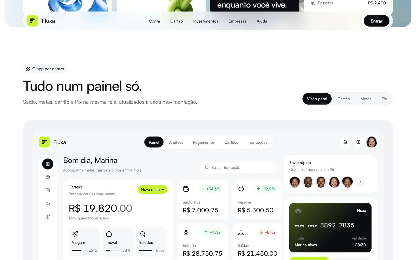
01 The dashboard working inside the page.
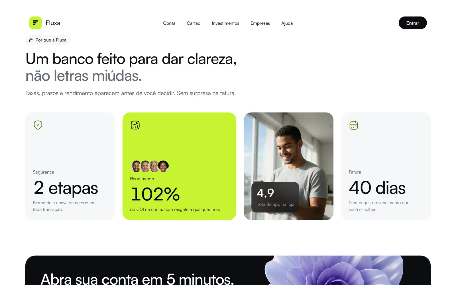
02 Clarity in numbers.
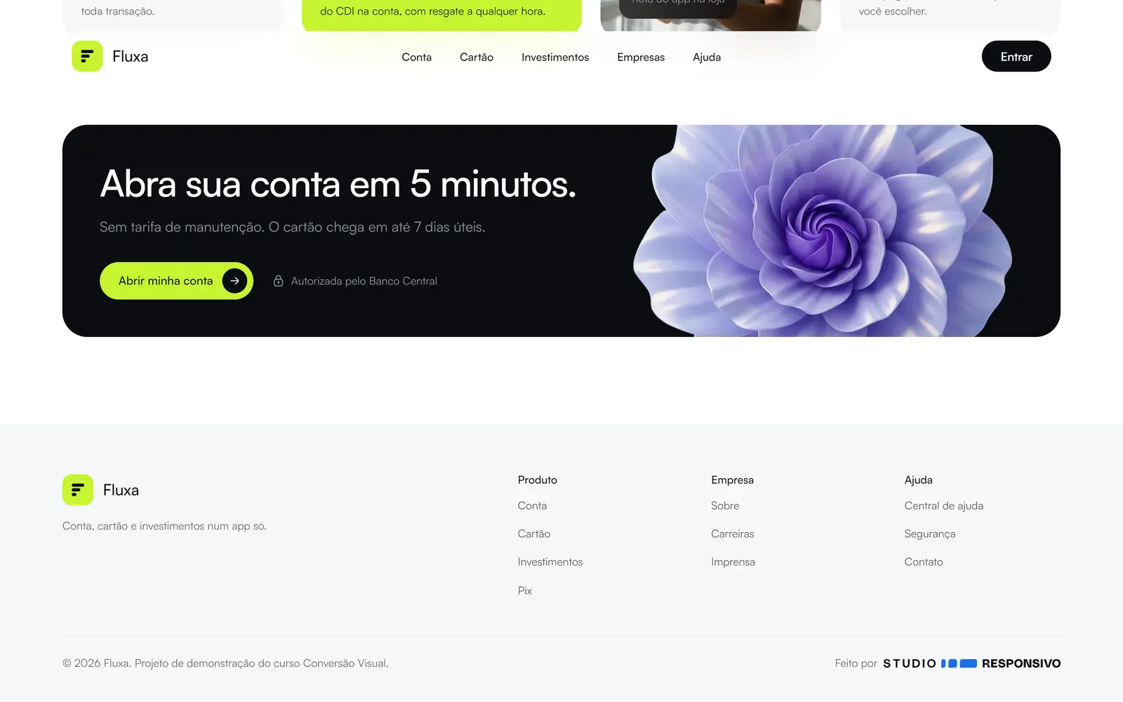
03 Final CTA.


Outcome
What changed
- 1 day
- from Figma to live
- Landing page
- Dashboard
- Design system
- AI images
