

Glad
Travel better.

- Type
- Landing page
- Industry
- Travel
- Platforms
- Landing page and system
The problem
Planning a trip on your own means opening twenty tabs.
Glad is for people who plan their own trips online: blogs, videos, maps, spreadsheets and screenshots scattered everywhere.
Before launch, Glad needed a waitlist, and the page had to explain a new product to people who had never heard of it.
Before launch, the page had to explain a new product and build the waitlist.

How the new generation plans trips: everything on one screen.
The solution
What we did
We designed the landing page around four verbs, which are the four parts of the product: get inspired, plan, organize and share. Each section shows the real interface doing just that.
The landing page in four verbs: get inspired, plan, organize and share, with the real interface.
The system works the same way: destination guides, place cards and an AI chat that plans the trip with the traveler.
Decisions
The 3 key decisions
What we decided before designing, and why.
Four verbs instead of a feature list
Get inspired, plan, organize, share. People understand the product in the order they'll use it.
The interface as proof
Every promise on the page comes with the screen that delivers it. No generic travel illustrations.
A single action
The whole page leads to the same place: joining the waitlist.
Project
The result
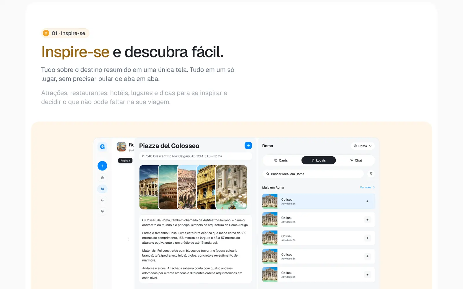
01 Get inspired: the destination summed up on a single screen.
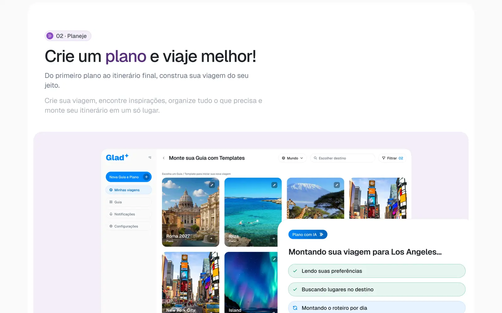
02 Plan with AI, from the first step to the final itinerary.
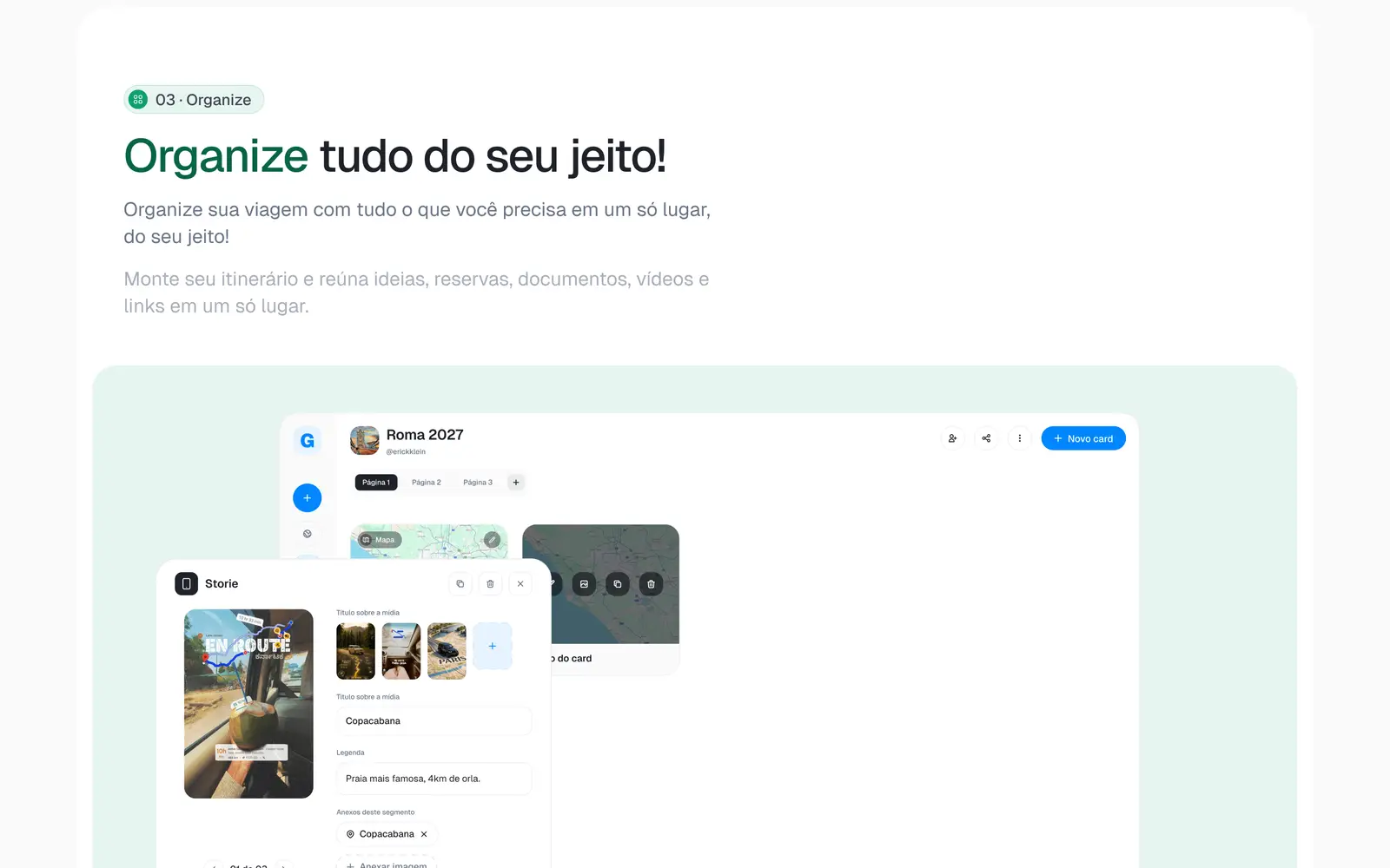
03 Organize everything your way.
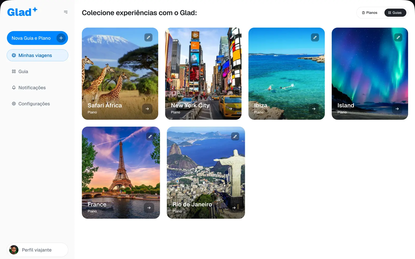
04 In the system: guides and experiences by destination.
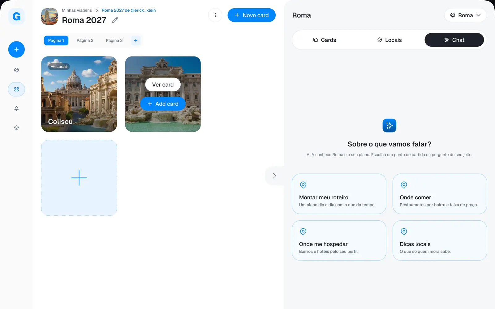
05 The trip space with the AI chat.
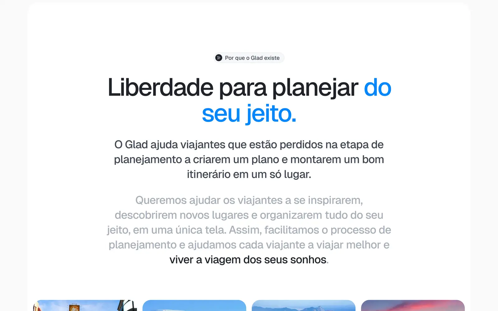
06 The manifesto: freedom to plan your way.
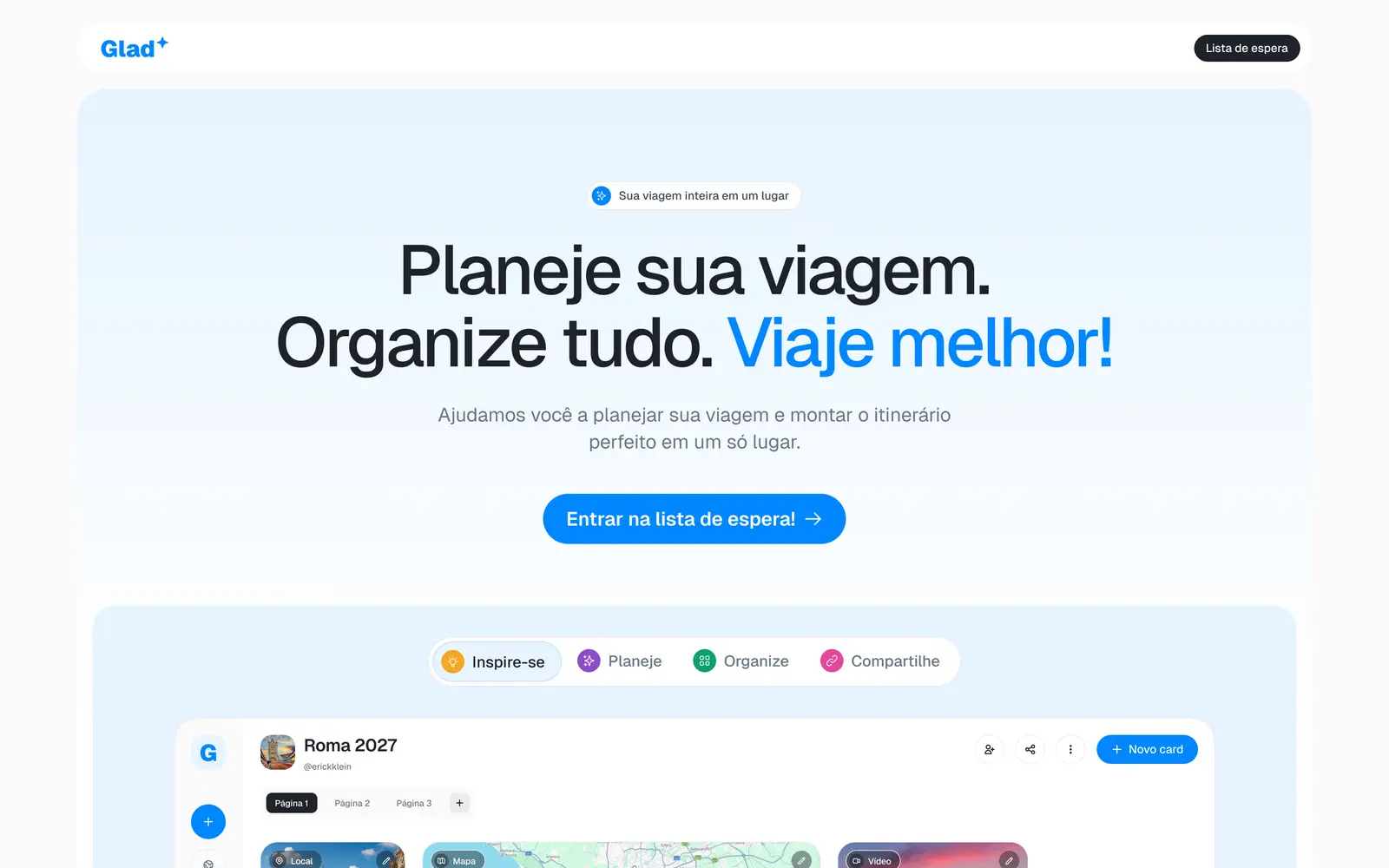
07 The top of the landing page and the call to join the waitlist.


Deliverables
What we deliver
- 01Landing page
- 02Mobile version
- 03System screens
- 04Waitlist
